My second time in the capital of the Nethelands – and I just loved it. What did I do the whole time? Eating bitterballen, talking in Dutch to strangers, visiting the Stedelijk Museum, drinking „glaasjes rode wijn“ and doing some shopping in 2nd-Hand stores … Tot gauw Amsterdam!
HTW berlin
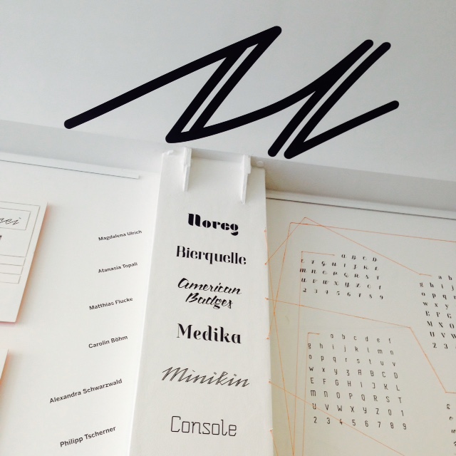
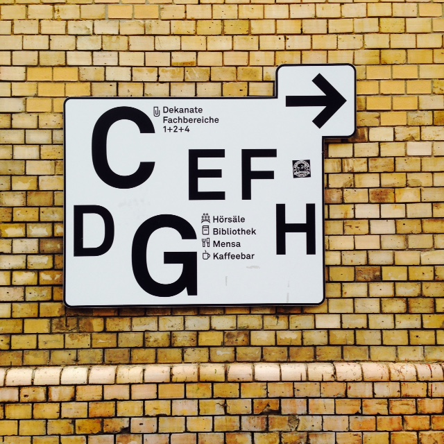
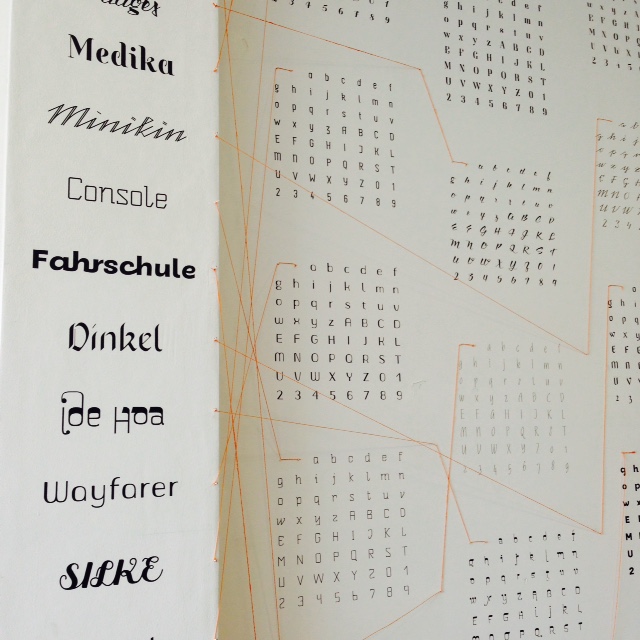
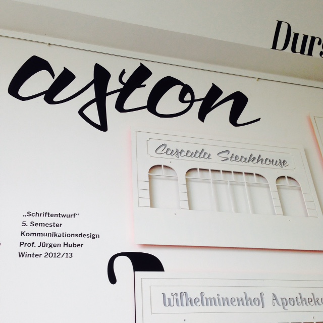
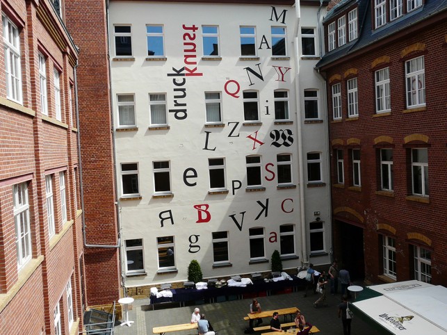
On my visit at the HTW Berlin I noticed some different typographical elements. Part of it was a wall dedicated to the topic „Font Design“ – under the lead of Prof. Jürgen Huber from supertype.
coffee and vaseline
Typography and Coffee as an art installation? Artist Nezaket Ekici used 10 coffee packs, a coffee machine, water, five packs of vaseline and some furniture to do her performance with following result . Her work will be shown until mid of August 2015 at Haus am Waldsee in Berlin.
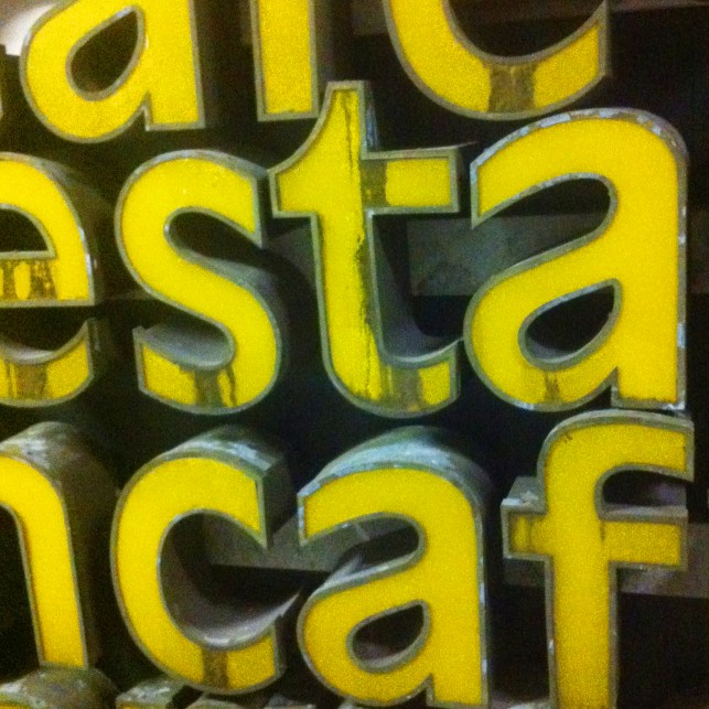
tipografía en Barcelona
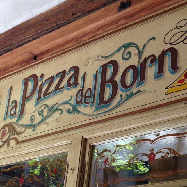
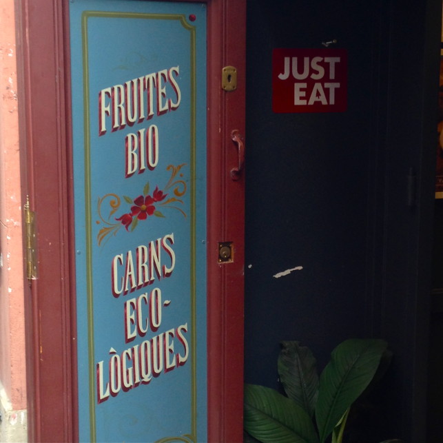
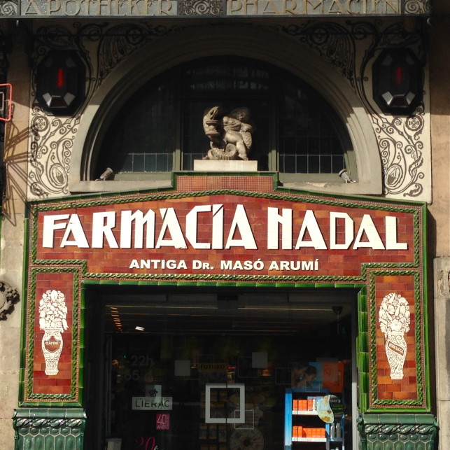
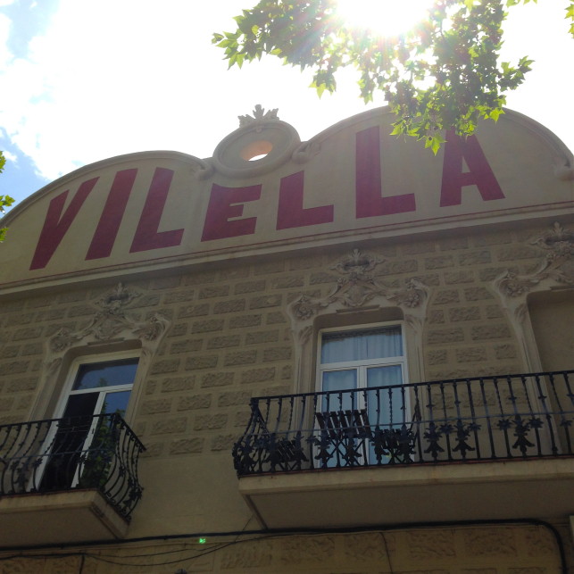
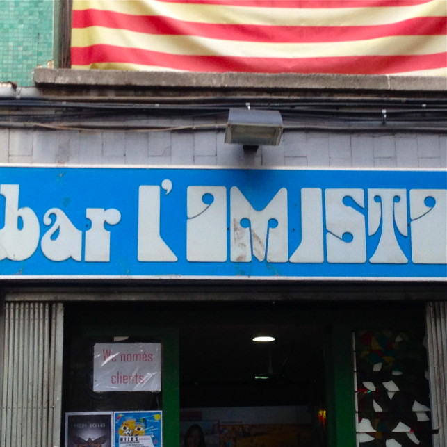
Walking through Barcelona by 36 degrees is exhausting … but at least you could see some beautiful lettering, quirky store fronts and art from Joan Miró.
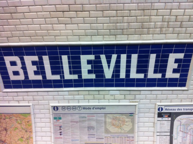
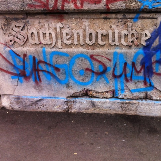
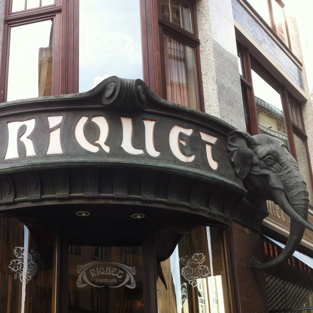
poetry leipzig
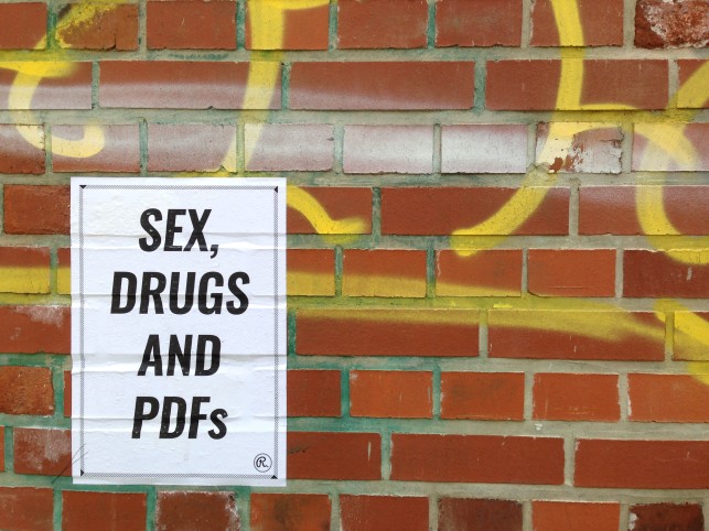
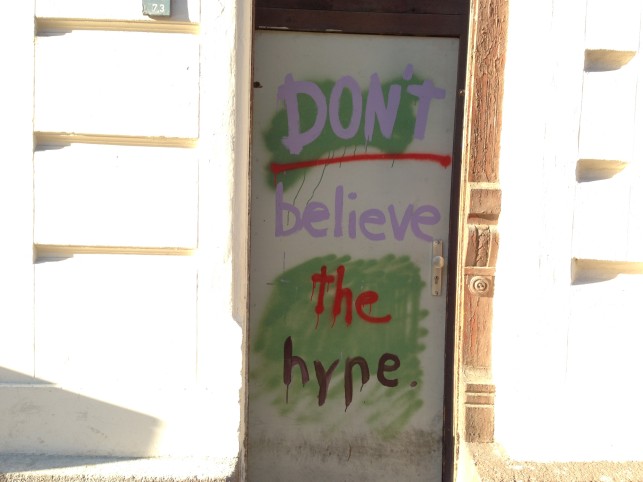
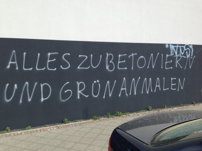
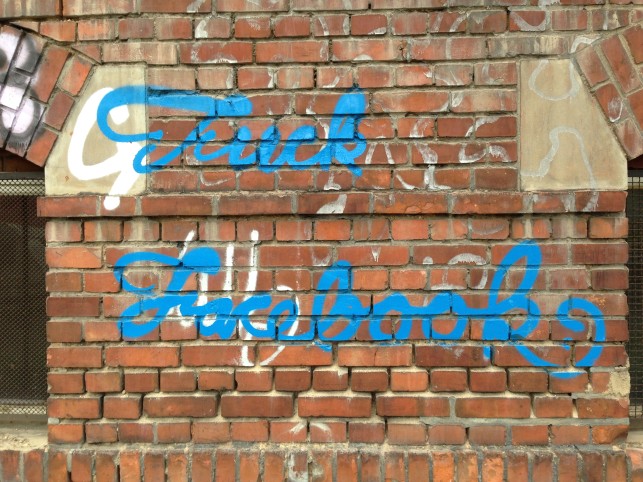
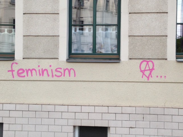
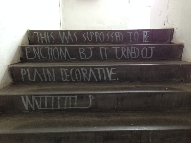
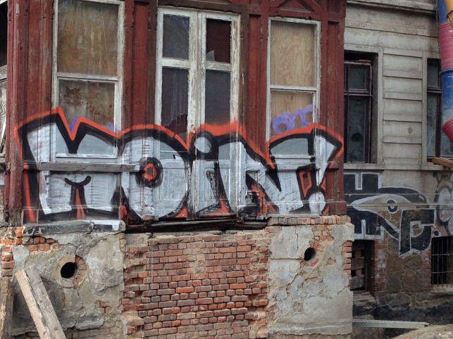
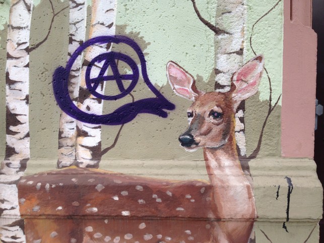
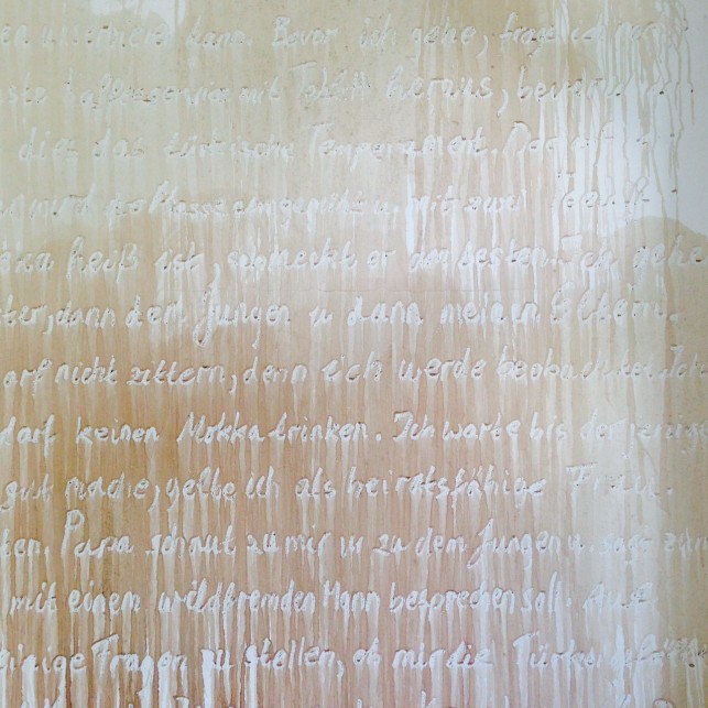
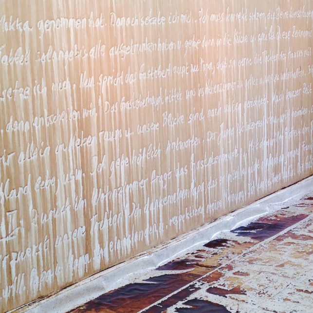
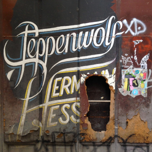
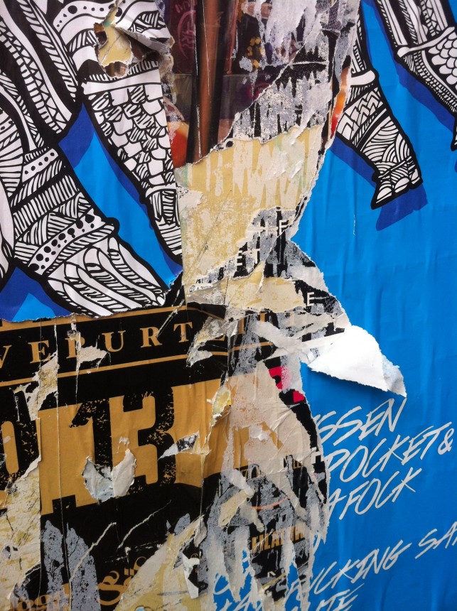
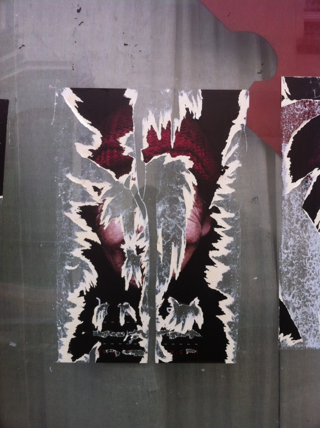
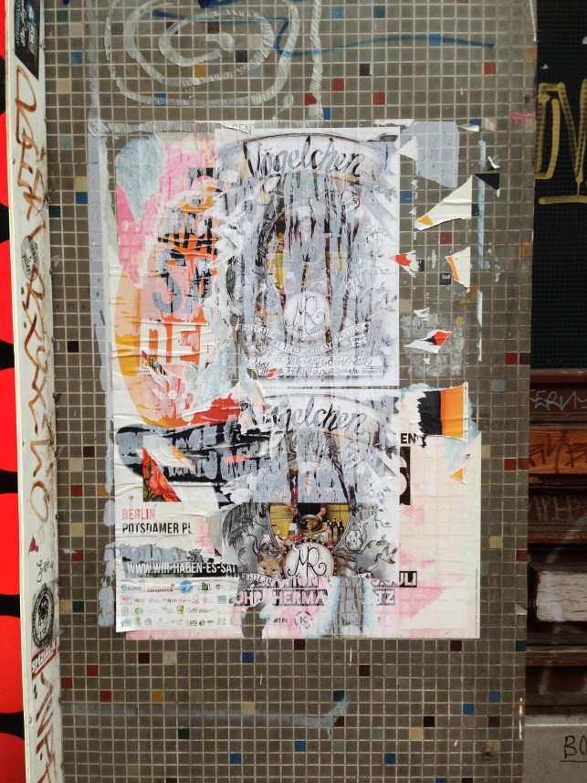
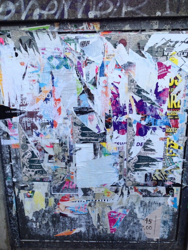
My second time in Leipzig and it still won’t be my last. Similar to the post I did about Neukölln (Berlin), there are a few vandalized expressions from Saxony.
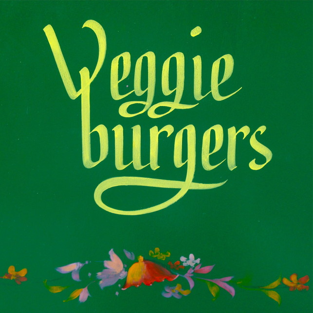
from a to z
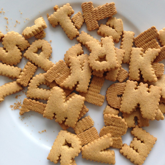
These yummie gingerbread cookies are beautiful! Sadly they lack some letters of the alphabet … I got them from a swedish furniture departement store – ring any bells?
Crisps Heaven
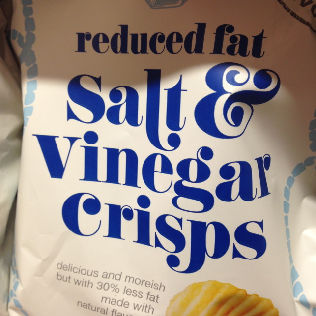
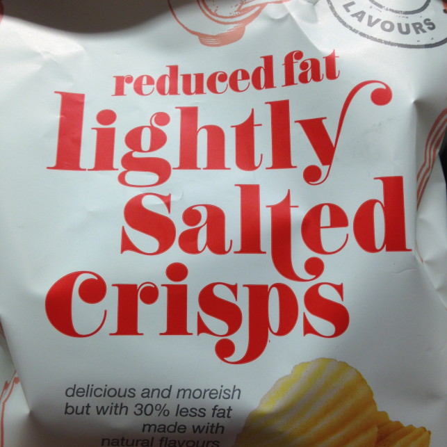
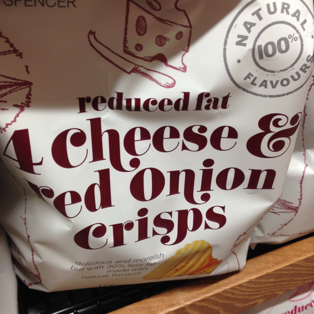
On my search for food at Marks&Spencer in Glasgow, I got sidetracked by the packaging of „reduced fat crisps“. This type is so curly, full of contrast and look at the lovely ampersand …

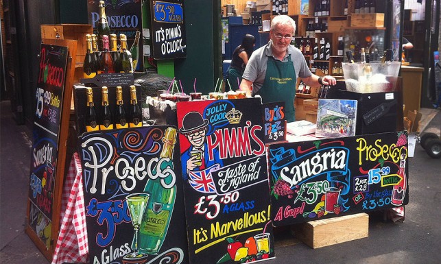
chalk & books
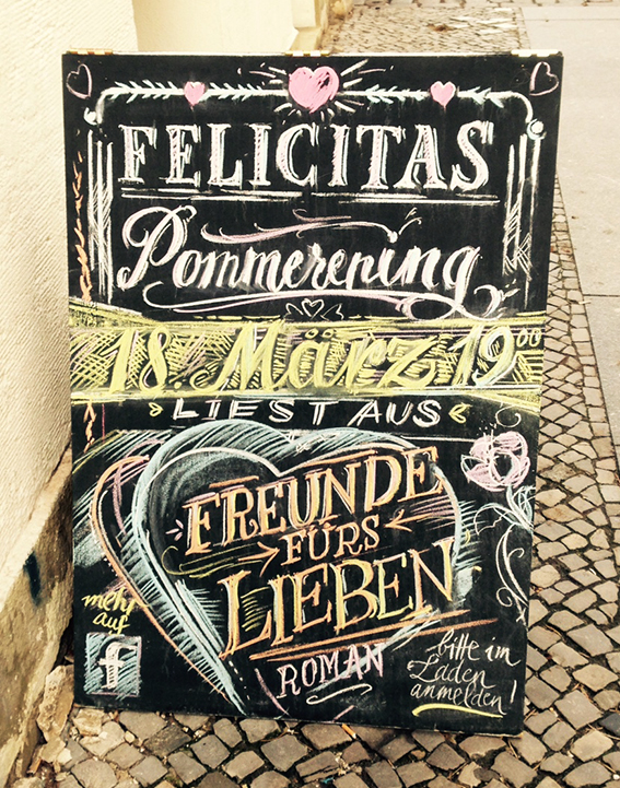
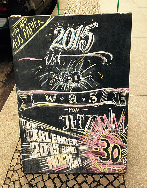
During my lunchbreak I spotted in the streets of Mitte two wonderful lettered chalkboards. They belong to the book store Hundt Hammer Stein, who is located in Alte Schönhauser Straße (2 minutes by walk from U8-station Weinmeisterstraße). Check it out if you’re around in the fancy, central district of Berlin.
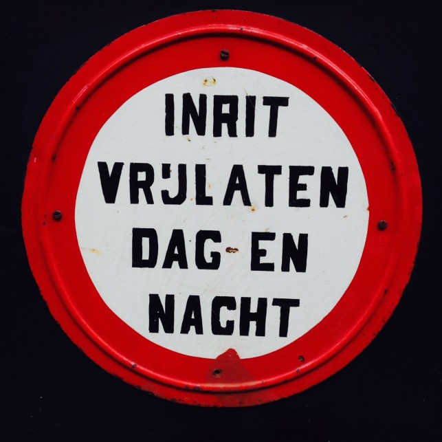
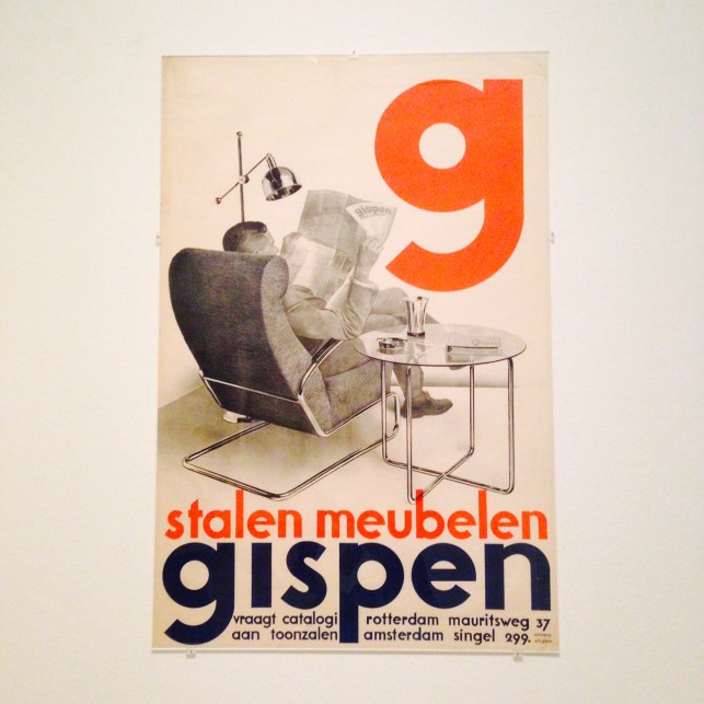
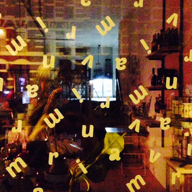
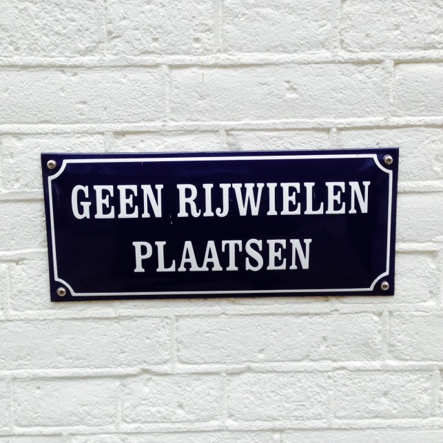
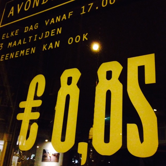
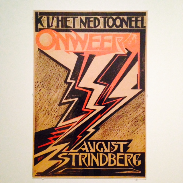
amsterdam: type & bikes
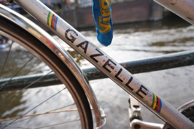
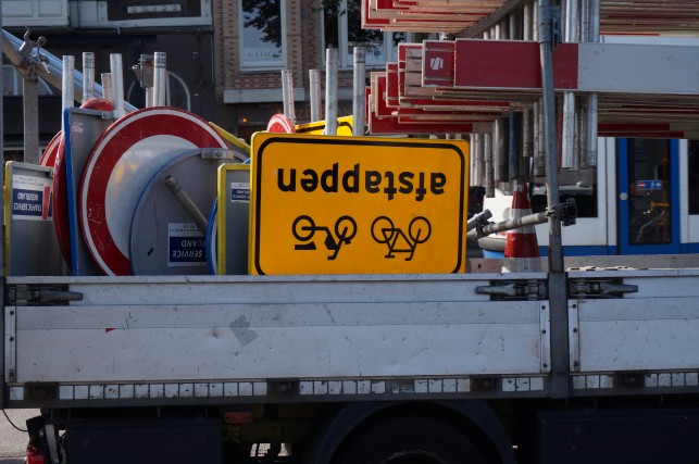
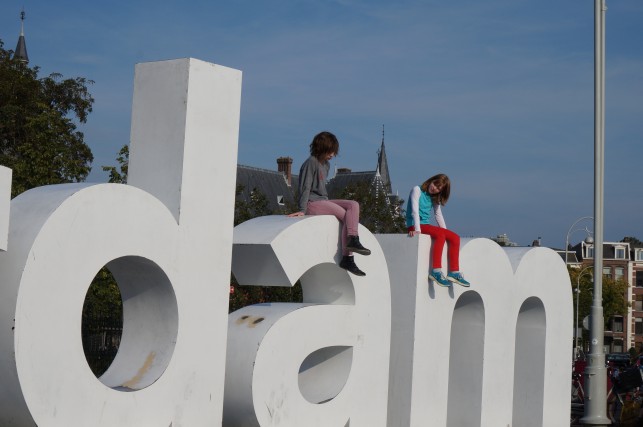
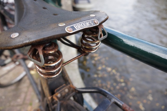
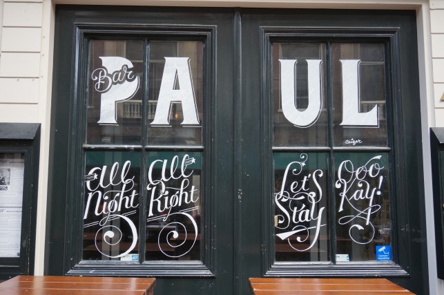
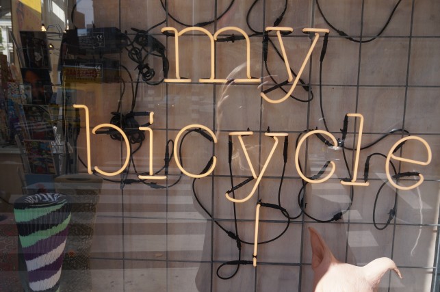
Exploring Amsterdam in the golden autumn was marvelous. I will definitively return next year to this place – eating some bitterballen with mustard, improving my Dutch and riding a bicycle.
comme ci, comme ça
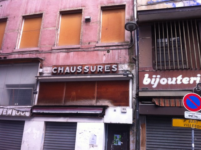
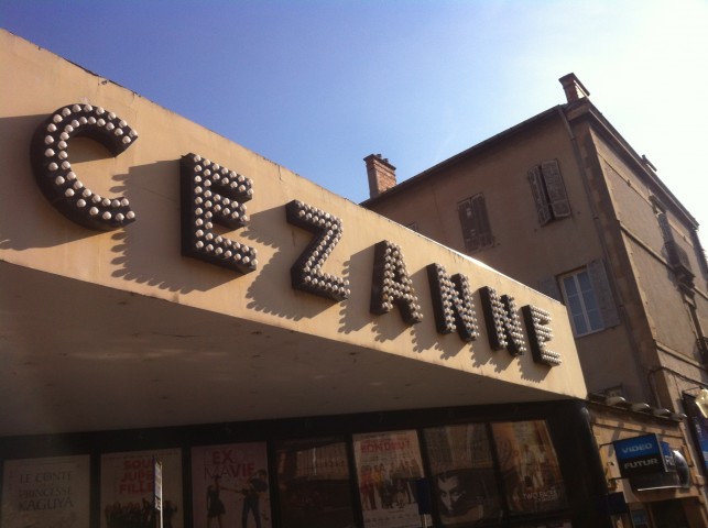
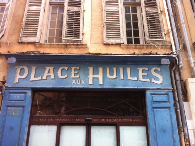
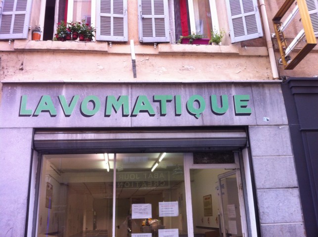
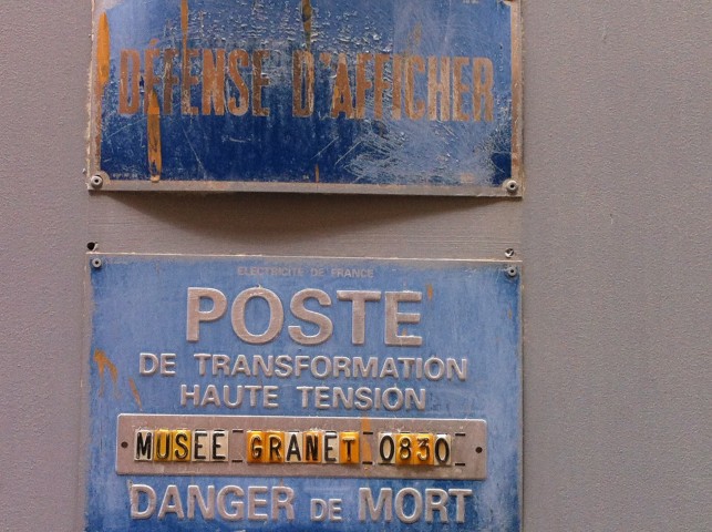
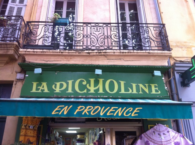
My personal „Tour de France“ – Aix-en-Provence, Lyon, Paris and Lille in 7 days …
Church of Type
Great short film of Kevin Bradley and the Church of Type. I love his work!
Starring Kevin Bradley | A Two Dollars Please & Angel Powers Production | Directed, Shot & Edited by Jeremy Asher Lynch | Produced by Angel Thompson | Original Score by Hanah Saxton | Audio Engineer Brian Arbuckle
Made for love letters …
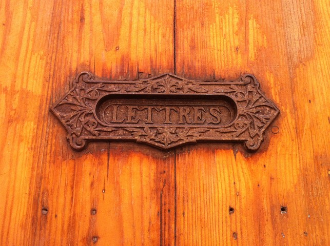
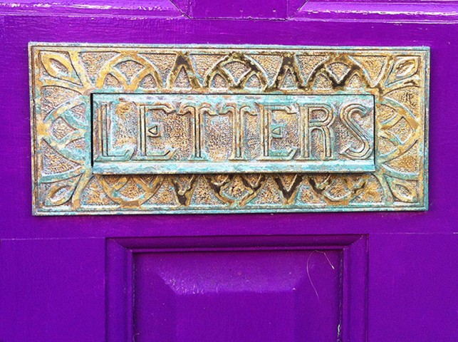
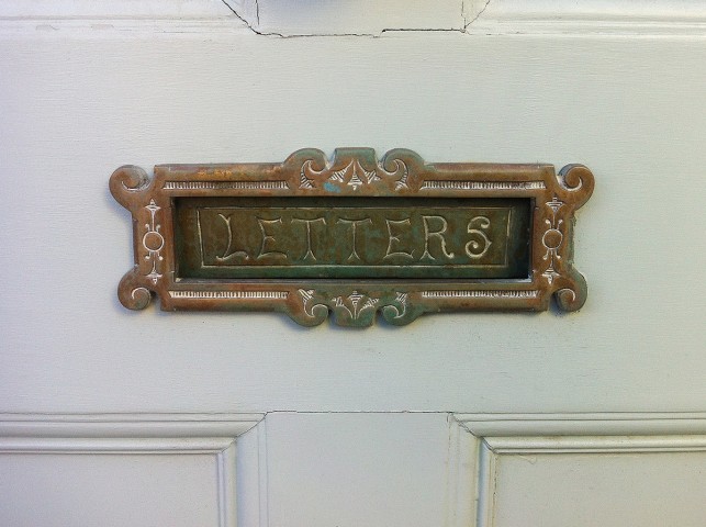
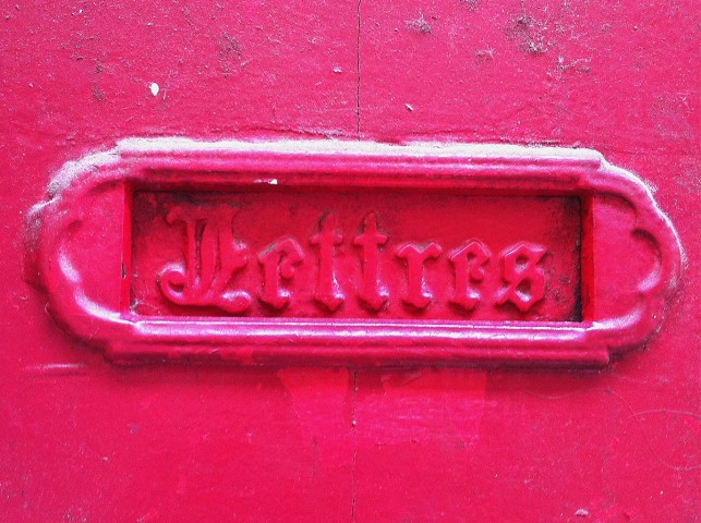
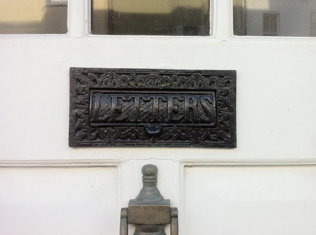
Have a look at these beautiful letter slots that I photographed in France and England.
Kerning would be lovely …
It’s not the most important thing in the world but sometimes it hurts my eyes.
Letters of Leipzig
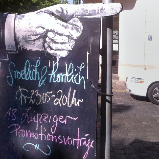
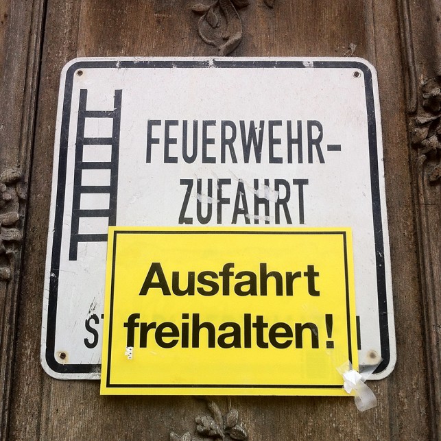
Leipzig by bike is a good idea – of course if the weather is lovely … On my way through the city I spotted some typography in inscriptions, posters and chalkboards.
Leipziger Typotage 2014
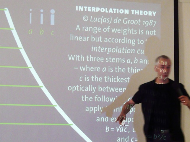
The 20th Leipziger Typodays: A good reason to make a trip to Leipzig. Here some impressions from the lectures and the location (Museum für Buchdruckkunst).
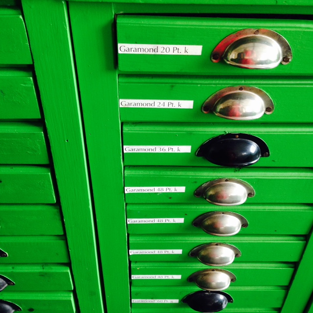
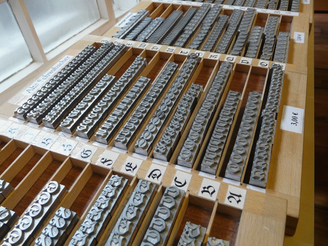
Letterpress Workshop
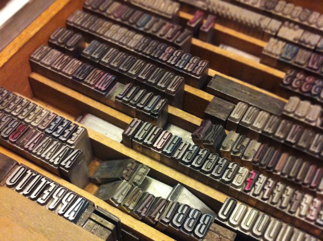
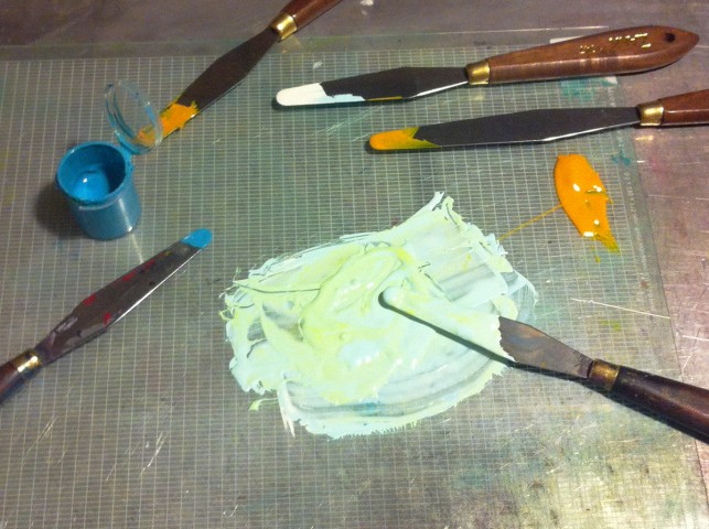
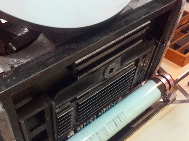
At „Small Caps“ – a little Letterpress Studio in Berlin, I joined a workshop. We were printing on a Adana 8×5 and it was so much of fun! Thanks a lot to Sabrina Sundermann.
19th century alphabets
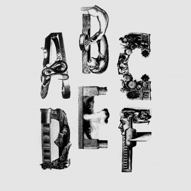
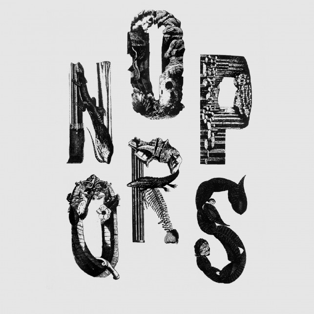
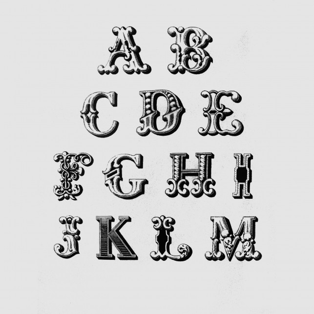
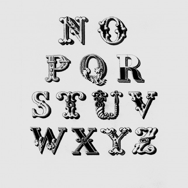
Last summer, I joined my flatmate on a trip to the UdK-library. Photographing was forbidden, but when I discovered this book, I had to shoot some pages.
Oslo: Lettering with Chalk
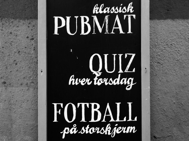
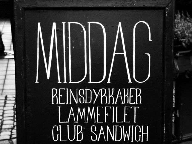
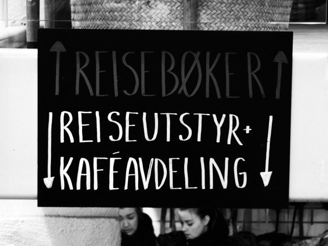

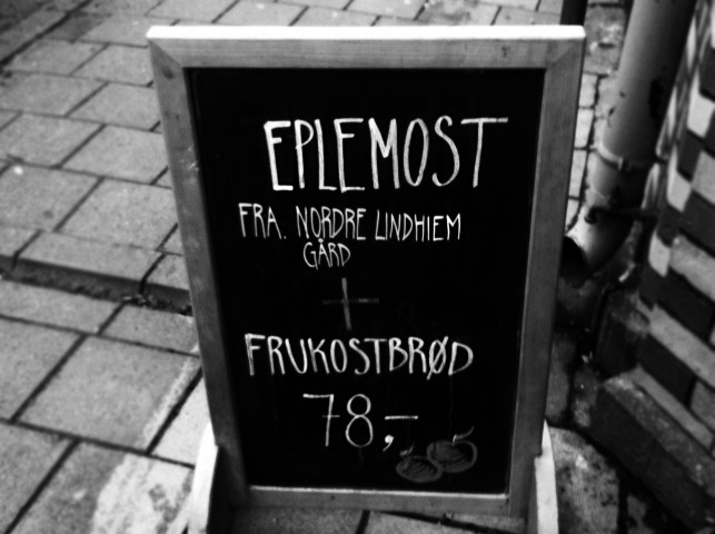
In February, I made a little trip to Norway to visit a friend of mine. While walking on the streets I noticed a lot of chalkboards with interesting lettering.


Lettering Workshop
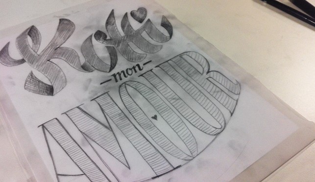
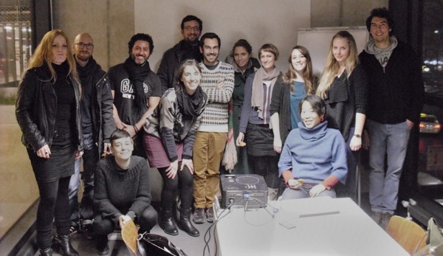
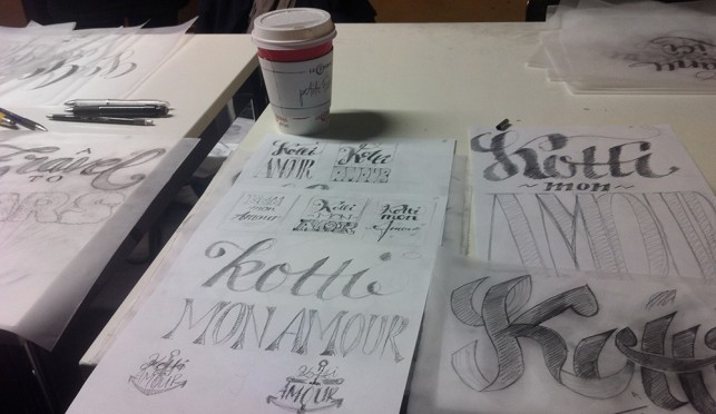
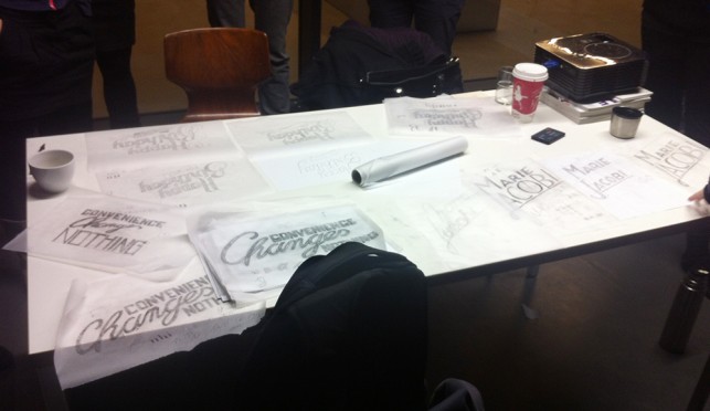
In Winter, I joined a lettering workshop with Martina Flor. Here are some impressions …
Buchstabenmuseum Berlin
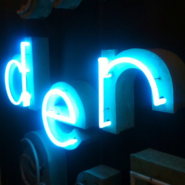
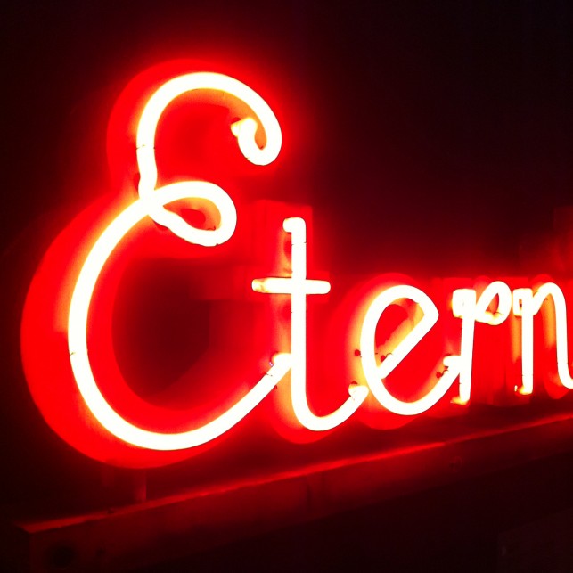
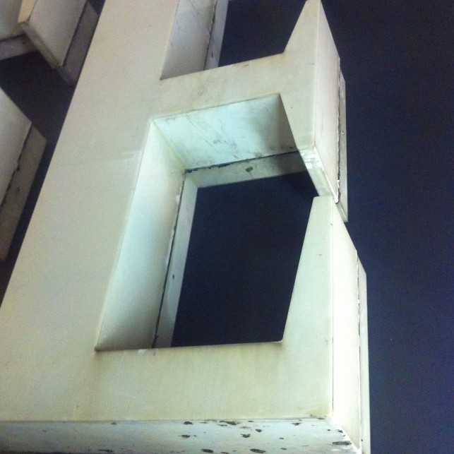
Here some shots from the Grand Re-Opening of the Buchstabenmuseum. After moving from Alexanderplatz to their new place (near U-Bahn-Station Jannowitzbrücke), they opened the museum on the 6th of December 2013.